3.1: Statistics – Visualising data
Visualization is critical to data analysis. While tables are necessary to record the data, it is usually very difficult to distinguish pattern in tables of numbers, particularly for large data sets. Graphs, however, allow the reader to see complex data sets simply and concisely. Plots can reveal hidden structure in the data, and outlying or unusual results, and they enable preconceived ideas to be challenged. Visualization of data is best described using an example.
Table IS3.1.1 contains a typical water data set that may have been collected as part of an operational monitoring program. A simple graphical representation of one analyte (iron in this case) from these data is presented in Figure IS3.1.1. The graph makes clear a number of features of the data that are lost in the table. The average of the data can be seen to be close to 0.2 mg/L and the majority of data lie between ± one standard deviation of the mean. Of note are 4 data points that exceed the aesthetic guideline value listed in the Guidelines, as well as periods where consecutive increases or decreases in the data have occurred. Such a chart is often referred to as a quality control or Shewhart chart, and is discussed further in Information Sheet 3.5.
Table IS3.1.1 Example of a water quality data set
28/11/1999
0.08
0.02
28/11/1999
0.1
0.005
30/01/2000
0.13
0.02
5/03/2000
0.09
0.01
37
15
0.5
125
16/04/2000
0.1
0.01
21/05/2000
0.13
0.01
18
105
25/06/2000
0.14
0.01
29
24
1
110
6/08/2000
0.12
0.005
35
12
0.7
120
3/09/2000
0.42
0.02
15
145
13
75
3/10/2000
0.16
0.01
15
27
1.6
99
6/11/2000
0.21
0.01
26
9
0.6
120
4/12/2000
0.25
0.01
27
18
0.6
125
8/01/2001
0.35
0.03
27
0.5
125
5/02/2001
0.26
0.02
24
0.8
120
5/03/2001
0.29
0.01
14
58
4.6
84
9/04/2001
0.22
0.01
24
0.9
110
15/05/2001
0.21
0.01
25
0.6
115
17/06/2001
0.21
0.01
26
0.6
115
16/07/2001
0.12
0.01
23
0.9
105
12/08/2001
0.11
0.01
23
8
0.7
115
9/09/2001
0.07
0.01
33
0.9
130
15/10/2001
0.16
0.01
24
19
0.8
110
11/11/2001
0.19
0.01
29
5
0.6
120
3/02/2002
0.36
0.03
28
5
0.9
136
11/03/2002
0.22
0.01
32
6
1
155
28/04/2002
0.81
0.04
43
5
2.6
218
26/05/2002
0.07
0.01
28
8
0.3
125
16/06/2002
0.11
0.01
25
6
0.6
116
21/07/2002
0.14
0.01
27
4
0.4
112
11/08/2002
0.24
0.01
18
18
12
82
8/09/2002
0.13
0.01
24
7
1.2
110
13/10/2002
0.12
0.01
31
5
0.4
131
10/11/2002
0.13
0.01
31
5
0.5
130
2/02/2003
0.18
0.01
16
19
1.7
85
16/03/2003
0.2
0.01
21
6
0.6
98
20/04/2003
0.17
0.01
24
5
0.5
108
11/05/2003
0.2
0.01
24
4
0.5
110
22/06/2003
0.17
0.01
31
3
0.9
111
21/07/2003
0.14
0.01
21
10
1
92
24/08/2003
0.14
0.01
27
4
0.5
106
7/09/2003
0.13
0.01
27
5
0.4
108
12/10/2003
0.14
0.01
32
5
0.5
125
16/11/2003
0.13
0.01
27
7
0.4
105
7/03/2004
0.16
0.01
31
4
0.6
128
Figure IS3.1.1 Graphical presentation of iron data from Table IS3.1.1
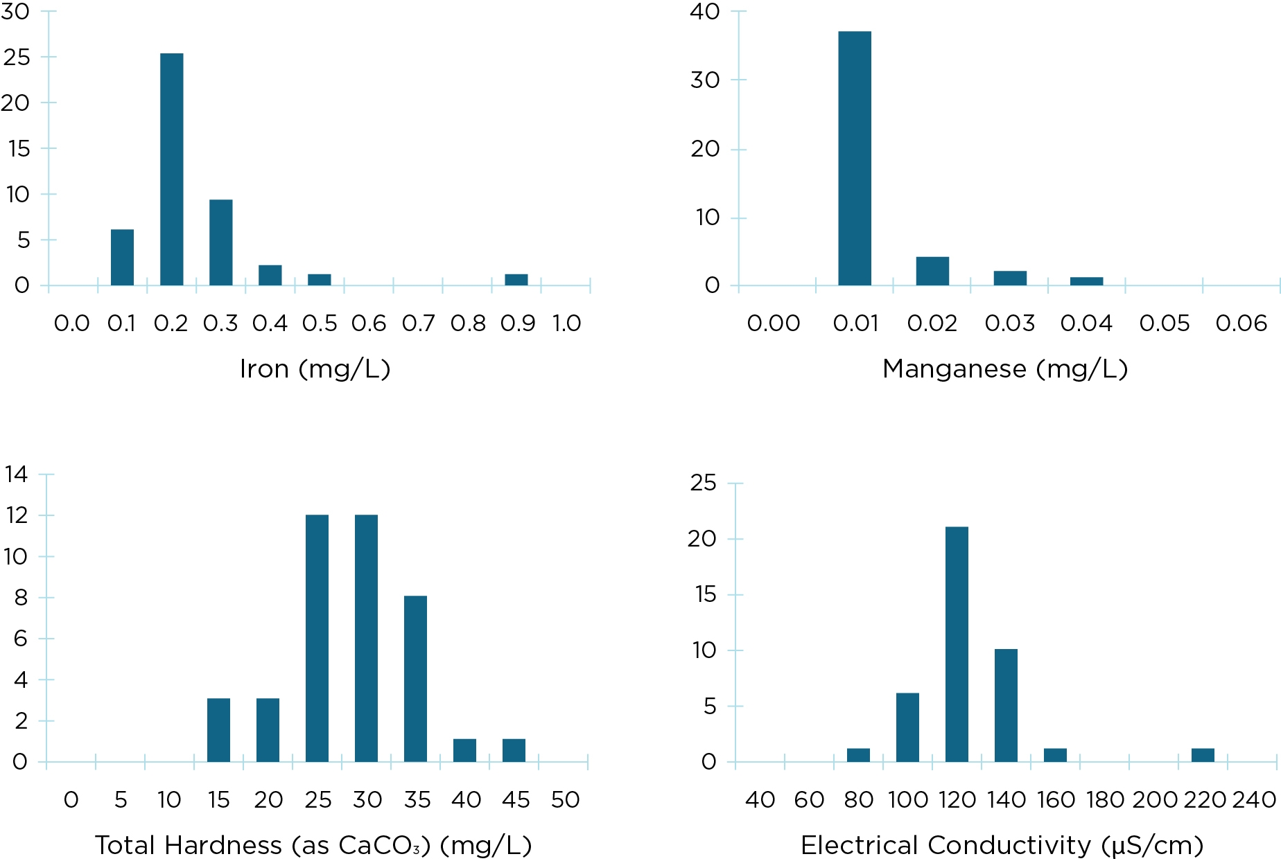
Another useful graphical representation of data is a frequency histogram (Figure 3.1.2) which can identify individual features of the distribution of the data and their relationship with other analytes. Frequency histograms can provide an indication of the normality of the data (or lack thereof in most cases). For example, compare the frequency histogram for total hardness with that for iron and manganese; the latter two show significant departure from normality. Tests of normality (e.g. using Anderson’s test or Maximum Likelihood) can be considered but are unlikely to be definitive when sample sizes are small, as is usually the case in water quality data. Further aspects of the distribution (e.g. skewness and kurtosis) also need to be considered. In practice, however, water quality data are rarely normally distributed. Accordingly, the use of alternative distributions (most notably, lognormal distributions) should be considered when significant departures from normality are observed.
Figure IS3.1.2 Histogram of data for selected analytes from Table IS3.1.1. Note that most data sets shown are evidently non-normal and skewed

In summary, the first step in data analysis is to present the data graphically, ideally both for the 12-month reporting period and for the full period for which data is available, or for a ten-year period.
If more detailed or involved data analysis techniques are to be considered the advice of a statistician should be sought.
Reference
AS/NZS 5667.1:1998 (1998). Water Quality – Sampling Part 1: Guidance on the design of sampling programs, sampling techniques and the preservation and handling of samples. Standards Association of Australia